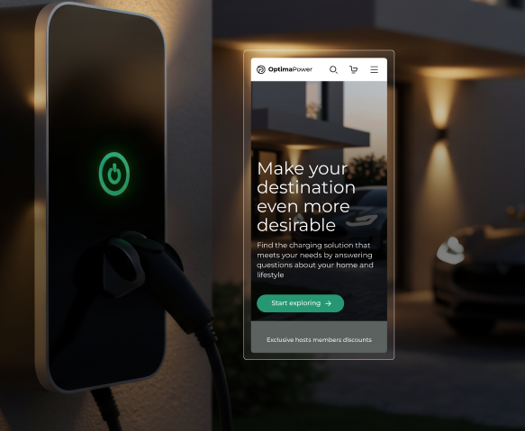
One of the largest International Airports in Europe.
This project was one of the parts of a two-year digital transformation for an international airport (name withheld under NDA; I'm calling it Rivergate for the ease of use). As a lead UX Designer, I owned the research, concept, and prototype. One of my tasks was optimization of the parking booking experience. Working with senior stakeholders, a product owner, and engineers, we set a 3-week window to get it done. I ran Lean UX, which means draft fast, test fast. We used A/B testing to get a clear result on how the new concept performed against the original. The results were clear. CSAT scores climbed, and customer support calls dropped by 20%.
Travellers were struggling to find and reserve spaces that matched their needs, and there was a real gap between booking a space and actually locating it on arrival.
Three weeks is short, that’s why I focused on one question: where does user pain cost the business the most? I ran a few initiatives to get the insights:
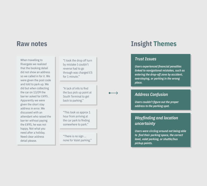
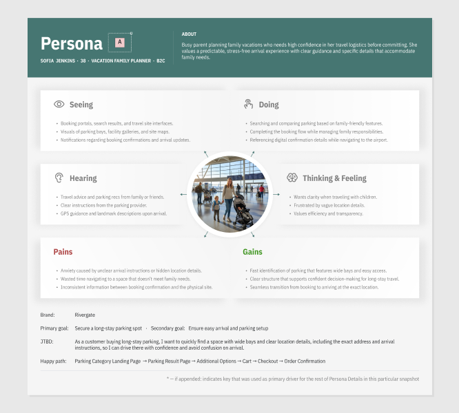
Address Confusion: The booking flow didn't surface a direct address. Travellers called in for it, or guessed.
Feature Uncertainty: Parking information was scattered. Users had to work hard to find them.
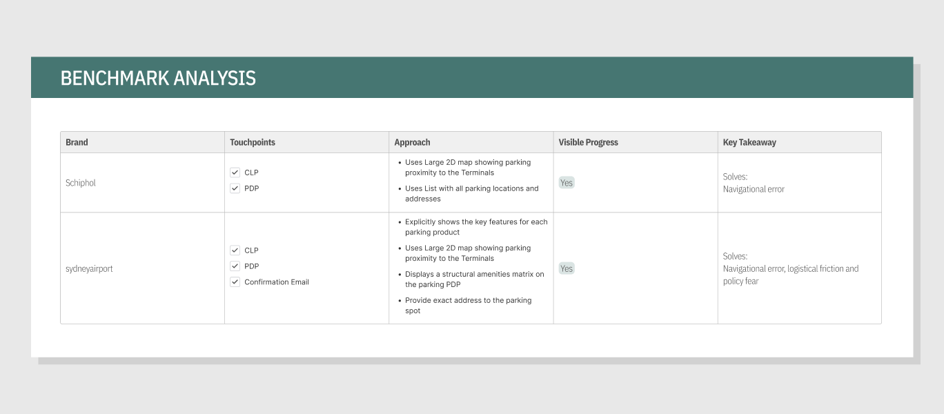
I audited global travel hubs to understand what good looked like. Sydney and Schiphol Airports stood out. They provided a good direction what could be used at the starting point. Contextual Guidance as an Anxiety-Reduction Tool: Both hubs have moved beyond static wayfinding. They employ dynamic, real-time mapping that provides precise navigation, taking users directly from their current location to a specific parking gate. This removes the "navigation friction" that typically occurs during the final step of a journey.
Before designing, I set the principles the work had to hold to:
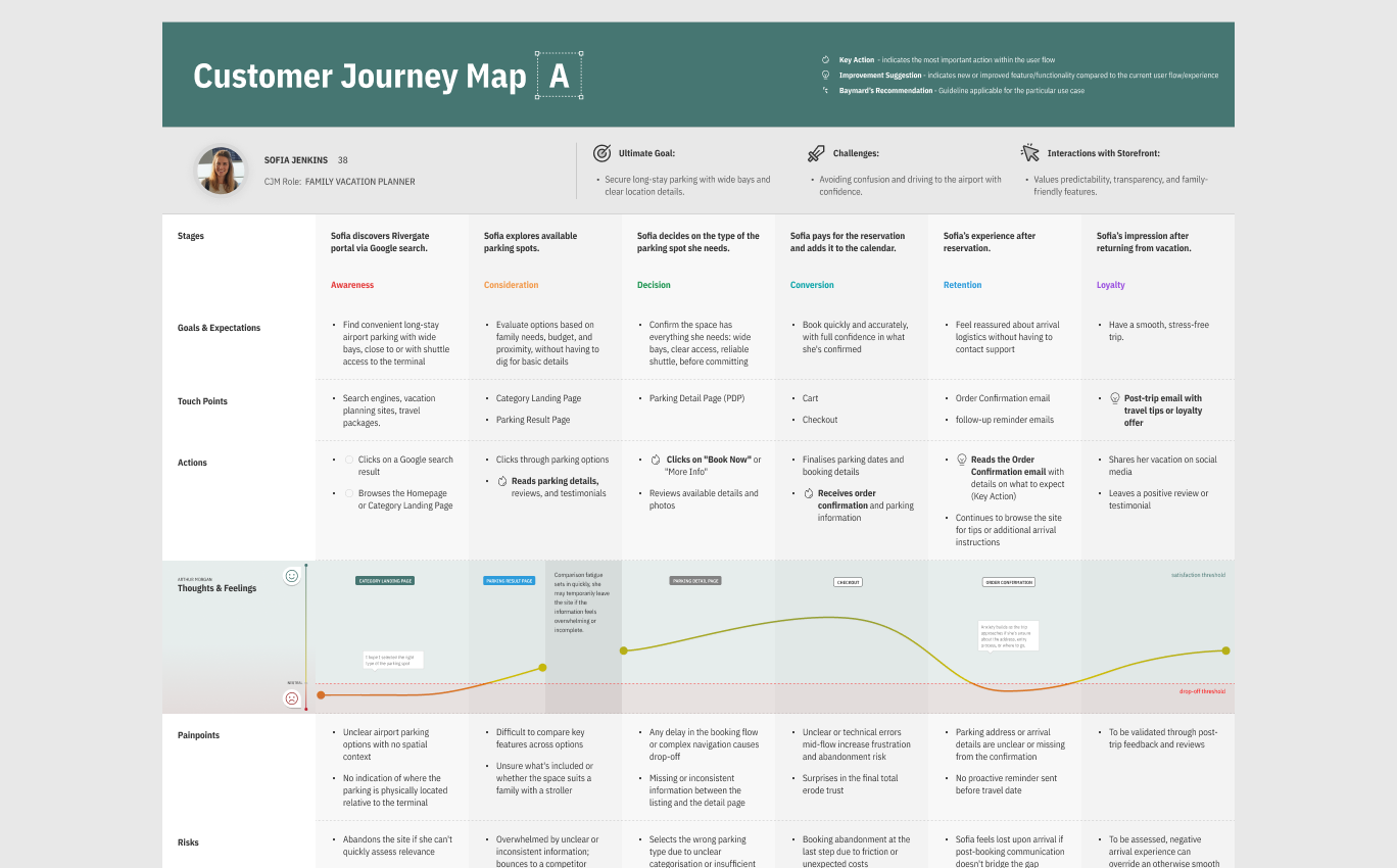
The CJM made it clear the fix wasn't one thing. Each touchpoint had a different job. The solution matched each one.
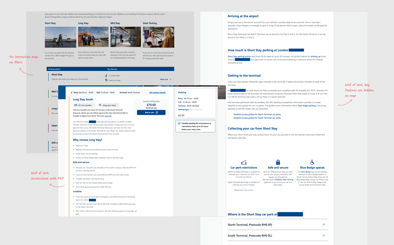
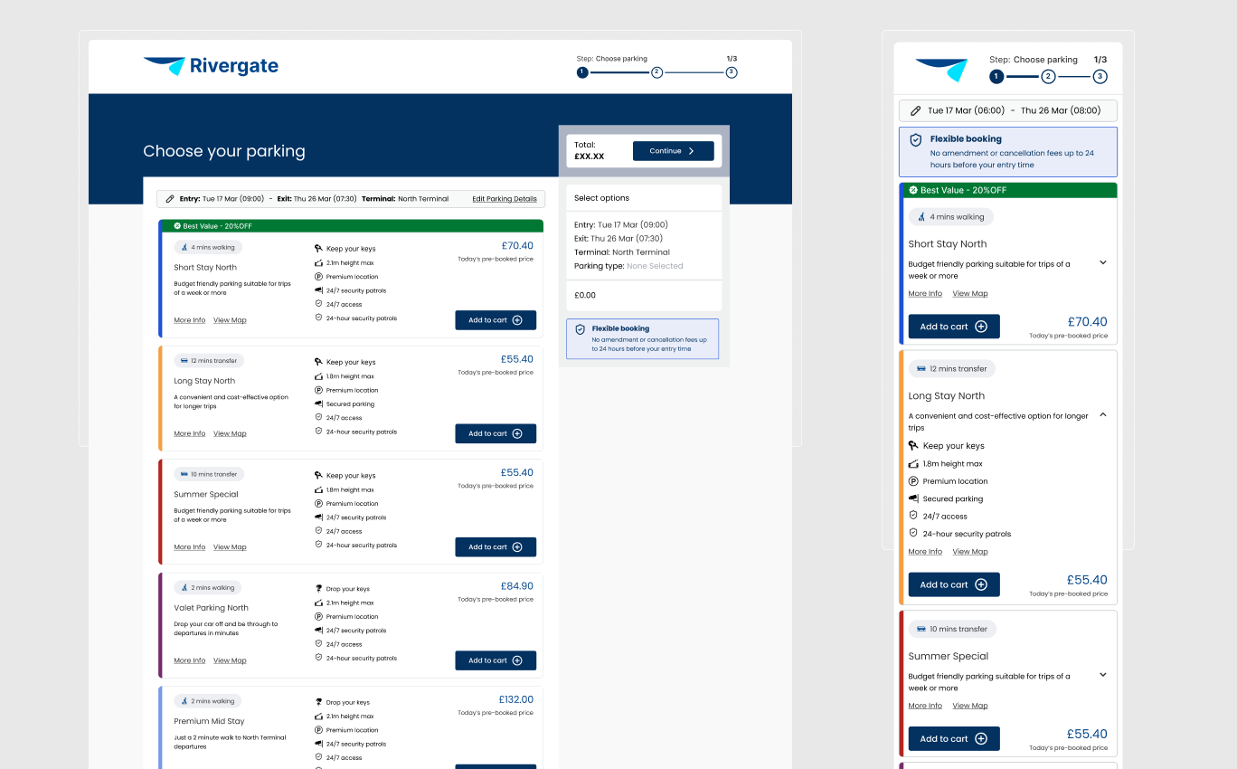
Category Landing Page Before travellers had no spatial context when browsing options. They knew the name of a car park, but they were struggling to make the choice. The new Parking Options Module placed an interactive map directly on the landing page. Selecting a car park updated the map in real time. The physical relationship between parking and terminal become visible before any decision is made. Tabs could be filtered by terminal, so geographically irrelevant options disappeared immediately.
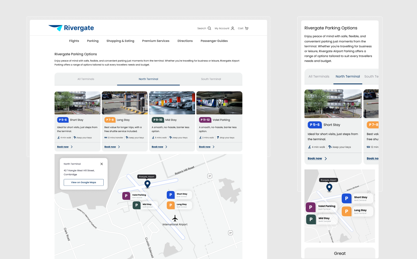
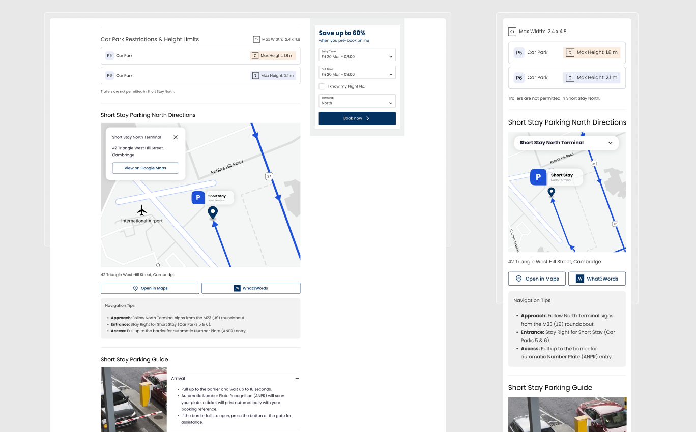
Parking Detail Page The existing PDP was a wall of text. Important information was buried. Travellers either read everything, missed what mattered, or gave up. The page was re-structured around interactive modules: key features, access limitations, vehicle height restrictions, and a dedicated directions section with the exact parking address, Google Maps integration, and step-by-step navigation tips covering approach, entrance, and access. An arrival guide walked travellers through what to expect when they get there, from ANPR entry to barrier behaviour. Everything a traveller needs to arrive confidently could be found in one place.
Parking Tiles The old tiles made comparison hard. Key differentiators, walking time, max. height, blue badge, etc. weren't visible at a glance. The redesigned tiles surfaced exactly what travellers had to compare at decision point. Walk time or transfer time appears as the primary feature indicator. Secondary feature become visible. Travellers could assess their options without too much investigation.
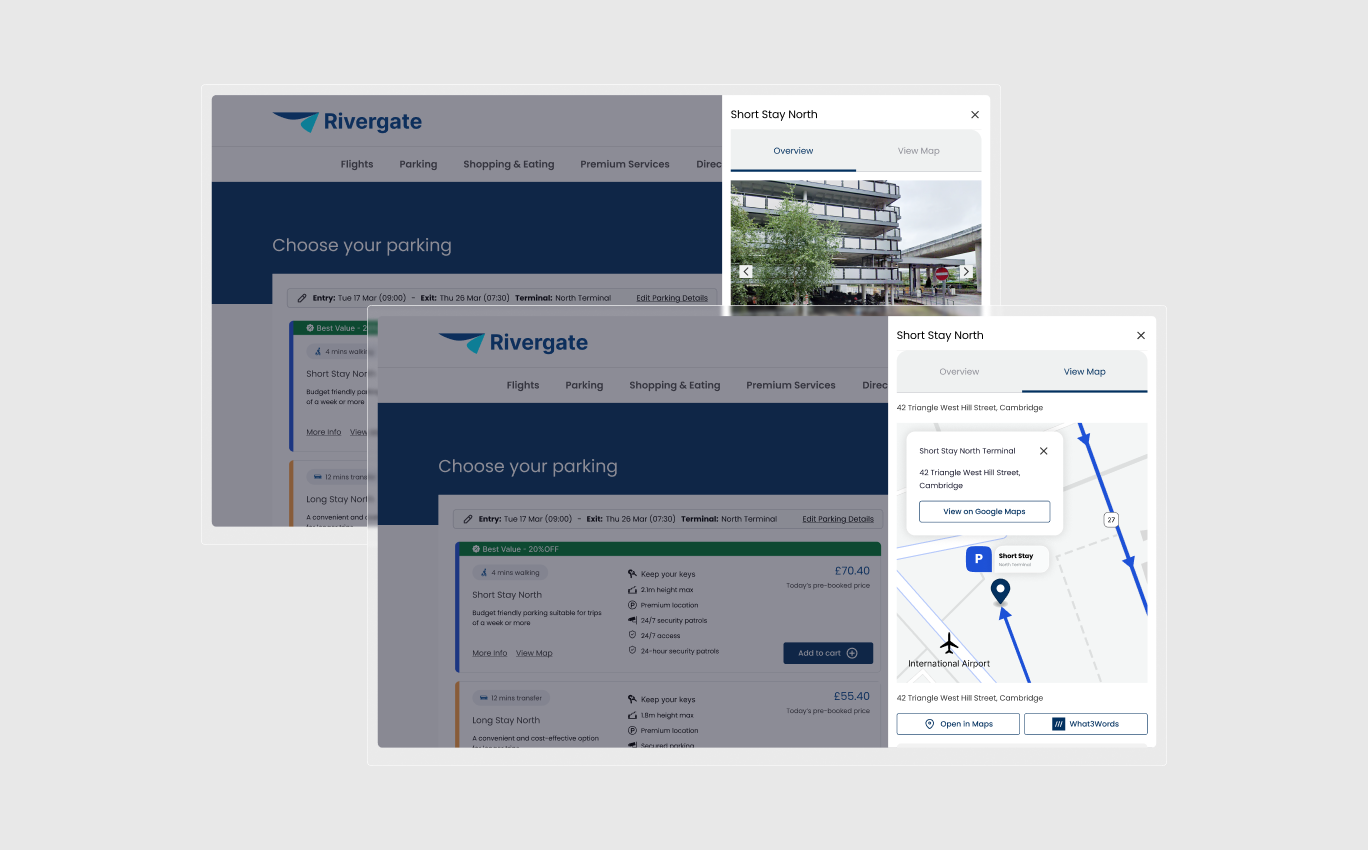
Parking Results Page The old "More Info" accordion was heavy and inconsistent. It expanded inline, disrupted the list, and buried the detail travellers actually needed for comparison. I replaced it with a side panel with two tabs: Overview and View Map. The panel became accessible across all devices without interrupting the results list. The information structure mirrored the Parking Detail Page exactly, because it pulled from the same data source.
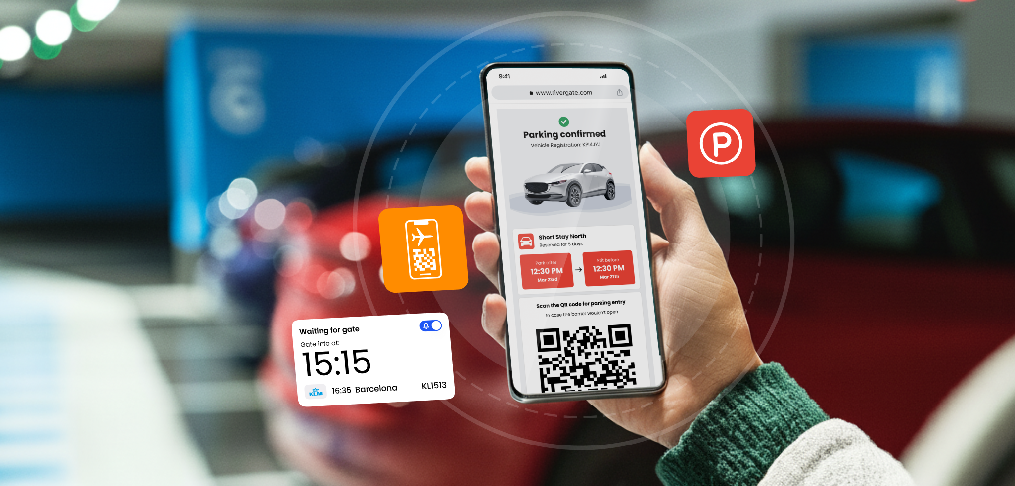
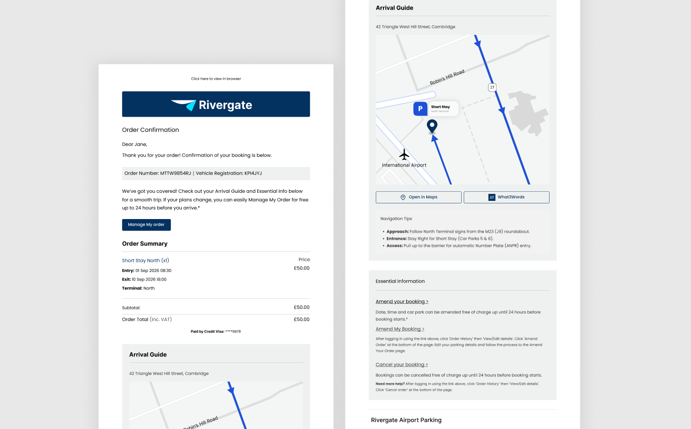
Order Confirmation and Reminder Emails This was the simplest fix with arguably the most direct impact on the trust problem. The exact parking address and arrival guidance appeared in every post-booking email and in pre-trip reminders. The information travellers need on the day was in the place they'll actually look for it: their inbox.
The results of the A/B testing were the following:
Both metrics pointed to the same thing: travellers who previously needed to call for help, or who called after something went wrong, were now getting what they needed from the product itself. The booking flow no longer ended at confirmation. It carried travellers to their space.
Three weeks is enough to solve a focused problem. It's not enough to validate every edge case. The side panel pattern worked well on desktop and mobile in testing, but I'd want more time to check how users confirm the information hierarchy under pressure. I'd also invest more in the post-arrival loop: the CJM showed a loyalty dip that good arrival experience could turn into a positive review. That story isn't finished. The data architecture win, one source of truth across the PDP and the side panel, was foundational. Any future work on this flow should protect that.
Shared experiences from the product minds and engineering partners I’ve worked with.


I worked with Oxana for more than 3 years and she is an amazing Art Director with great UX skills. She is probably the best designer I have worked with. Her dedication and talent know no limits. Her advices are always right and pertinent. She is an incredible asset for any teams.
During her time at Astound, Oxana has consistently proved herself to be an absolute powerhouse Senior UX Designer. In many ways, she functioned as our “special ops” designer - the exact person you want in the room when a product or feature simply doesn't exist yet...
During her time at Astound, I had the pleasure of working with Oxana across multiple projects. She brings genuine enthusiasm to every UX challenge and is highly collaborative in her approach. Oxana builds strong client relationships and confidence through thoughtful...
Oxana’s passion for excellent design shows in everything she does. She tackles every challenge with a smile and brings a perfect mix of designer curiosity and user empathy to the table. Beyond her great professional skills, she is a wonderful person to be around...