EV charging stations for residential and commercial use in North America.
This project opened a new market segment: short-term rental property managers who wanted to make their listings more competitive by adding EV charging.The opportunity was clear. The rental platform was adding EV charging as a searchable listing filter, putting it directly in front of millions of traveling guests. Property managers who acted early would gain a meaningful edge. OptimaPower's challenge was to reach them first, and make the purchase decision easy enough to actually convert.
My role spanned the full 0-to-1 arc: discovery, stakeholder workshops, information architecture, selection logic, and purchase flow design. Over four weeks and two design sprints, I transformed OptimaPower from a single-product catalog into a guided, bundled hardware-and-installation experience built specifically for property managers.
EV charging is not an impulse buy. It is a site-specific infrastructure decision shaped by property type, electrical capacity, parking configuration, ADA constraints, local demand, and budget. For a property manager juggling multiple listings, that complexity is a reason to delay, not explore. The core design challenge: make a high-cost, high-complexity B2B decision feel as clear and trustworthy as a consumer purchase.
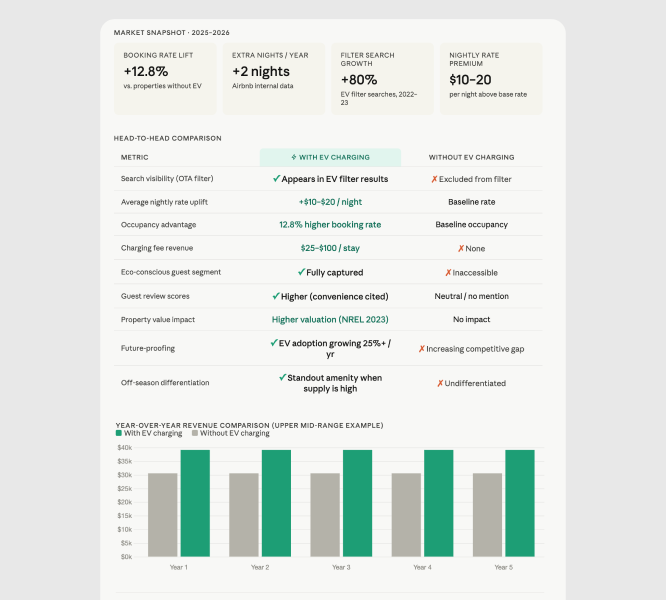
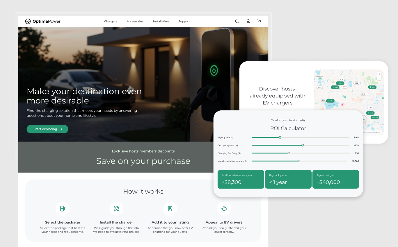
I started with a competitive analysis to understand whether the business case. The data was compelling. Between 2022 and 2023, property listings with EV chargers gained an average of two incremental booked nights per year. Searches using the EV charger filter increased by more than 80%. For an upper mid-range property, the device and installation costs could be recovered in under two years. That ROI story became the backbone of the landing page strategy.
To understand the user side, I built a property manager persona: Mason Chen, 41, managing a small portfolio of short-term rentals, focused on occupancy and guest satisfaction. Mason is not anti-technology. He is cautious. He worries about hidden installation costs, wants to stay ahead of guest expectations, and needs decisions validated before he brings them to property owners. He is not looking to be sold to. He is looking for a trusted recommendation.
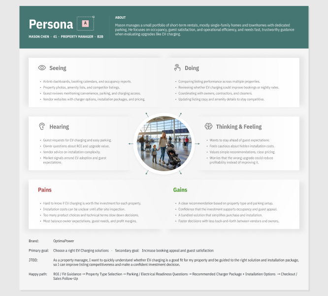

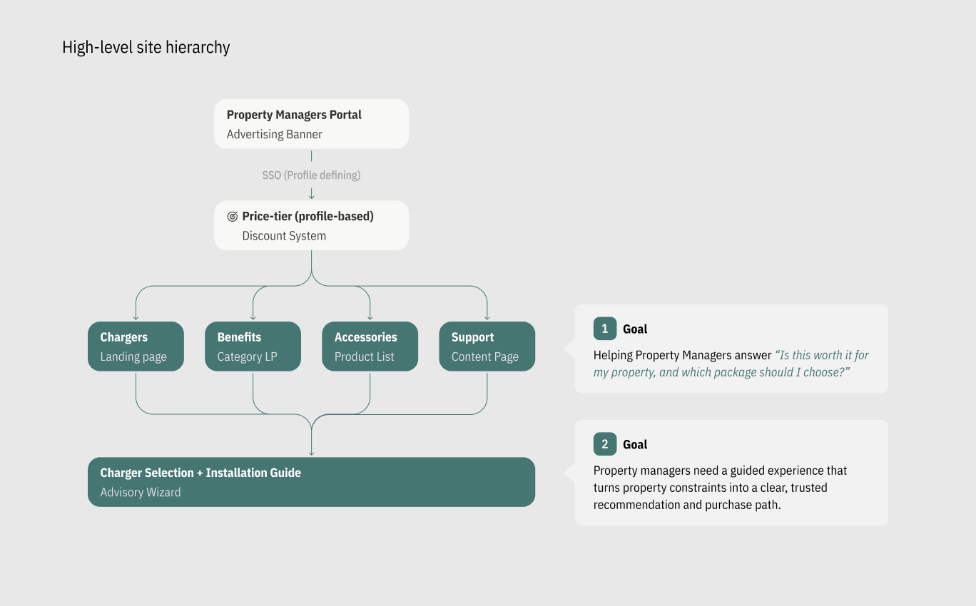
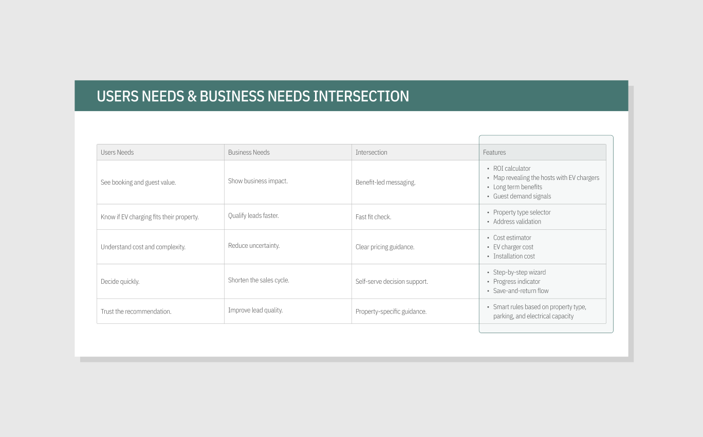
User Needs: Property managers want clear, tailored recommendations based on their property type and portfolio size. They are not browsing. They are looking for a trusted answer to one question: is this the right investment, and which package should I choose?
Pain Points: Decision-making stalls when costs feel unclear and technical complexity feels unmanageable. Hidden installation expenses, too many product choices, and unfamiliar terminology do not help Mason decide. They give him a reason to delay.
The MVP direction centered on one principle: Confidence-Driven Design. Every screen had one job: reduce a specific source of anxiety before asking the user to move forward. I mapped user needs against business requirements to define the feature set. Four design pillars guided every decision:
Key UX Decisions
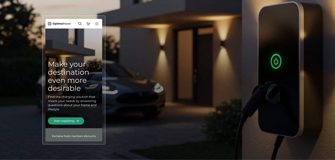
Category Landing Page.
The landing page had one job: answer "is this worth it?" before Mason clicked anything else. It led with benefit-driven messaging, a map showing hosts already equipped with EV chargers, and an interactive ROI calculator. The calculator was the most important trust-building element on the page. By letting users input their own nightly rate, occupancy, and charging fee, it replaced marketing claims with personalized financial projections. Seeing a payback period under one year, calculated with their own numbers, did what no headline could.
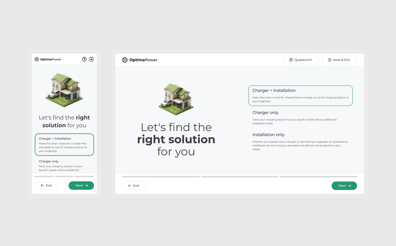
Wizard Navigation.
The wizard opened by asking what type of solution Mason was looking for: charger and installation, charger only, or installation only. That single question acted as a branching gate, filtering irrelevant steps before they appeared and keeping the flow lean from the first interaction. The navigation included an AI-assist chat option, and Save and Exit function allowing users returning to this process at any stage.
Wizard Educational Content.
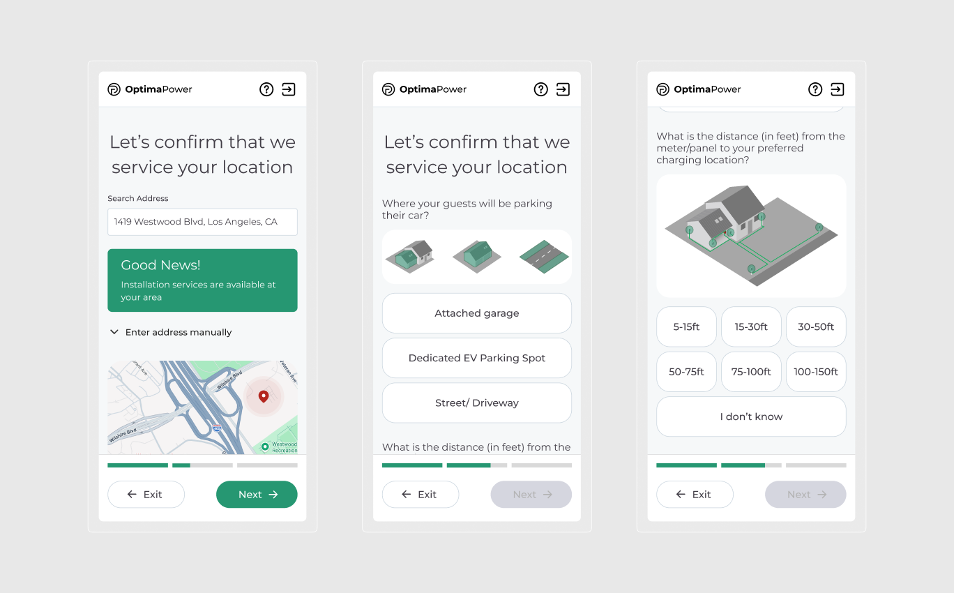
The information architecture followed a funnel logic: broad context questions first, specific technical inputs last. Property type came before parking configuration, because the answer to the first question changed the meaning of every question that followed. A multi-family building triggers a specialist referral path. A single-family home continues through the self-serve flow. The branching was invisible to the user but deliberate in the logic. Each step consolidated related inputs on a single screen to reduce cognitive load without hiding complexity. Property type, parking spot type, and number of stations were grouped by decision context, not by data type. Inline educational content appeared at the exact moment a user needed them, not before, not after.
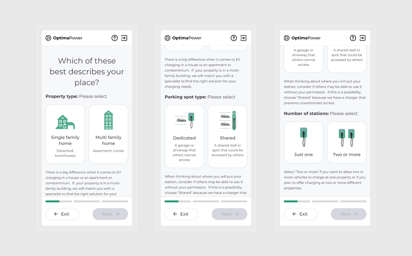
Wizard Address Validation
Address validation was placed mid-flow, after intent was established but before the recommendation was generated. This served two purposes: it qualified the lead for the business, and it gave Mason early confirmation that his property was serviceable, reducing a key anxiety point before he reached pricing.
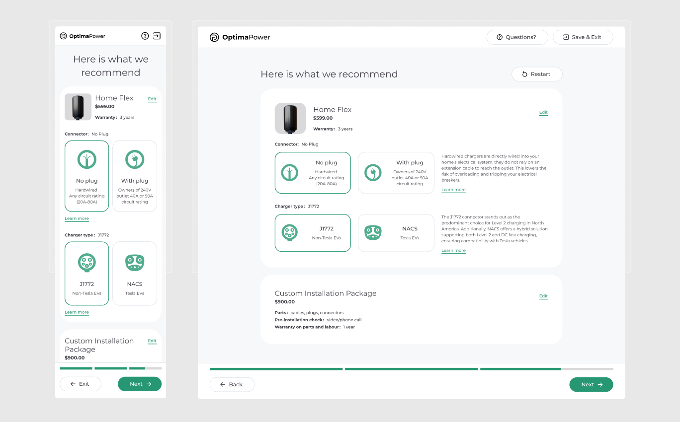
Product Recommendation
The final recommendation screen surfaced a specific charger model, connector type, and custom installation package. Every element was editable inline, so Mason could adjust without restarting the flow.
I structured the project around Conversion-Centered Design, a framework that prioritizes removing friction at every stage of a decision funnel rather than optimizing individual screens in isolation. For a user where trust drives conversion more than aesthetics, this was the right lens. Four weeks. Two design sprints. The first sprint covered discovery: stakeholder workshops, competitive analysis, persona mapping, and information architecture. Getting the structure right early meant the second sprint could move fast into interaction design and prototype delivery. Stakeholder reviews were built into the sprint cadence, not added at the end. That kept feedback actionable and avoided late-stage pivots. I chose this process because the problem was as much a systems challenge as a design one. The branching logic, discount tiers, and address validation all needed to be defined before a single screen could be designed with confidence. Conversion-Centered Design gave me a framework to hold the business funnel and the user journey in the same view simultaneously.
The MVP reached stakeholder approval after two sprints, with high satisfaction across the client team. The program generated strong early interest from property managers, validating the market opportunity the discovery phase had identified.The wizard architecture and discount logic were well received as a strategic foundation. However, the team decided to launch with a smaller selection of charger models to manage catalog complexity. That constraint simplified the wizard logic and shaped the final MVP scope, but the core experience structure remained intact as the foundation for future iterations.
The catalog complexity that simplified the wizard was something we could have caught earlier. A quick product audit at the start would have shaped the wizard logic from the beginning, not revised it after the prototype was done. Starting with fewer charger models was the right call. I would just make that call in week one.
Shared experiences from the product minds and engineering partners I’ve worked with.


I worked with Oxana for more than 3 years and she is an amazing Art Director with great UX skills. She is probably the best designer I have worked with. Her dedication and talent know no limits. Her advices are always right and pertinent. She is an incredible asset for any teams.
During her time at Astound, Oxana has consistently proved herself to be an absolute powerhouse Senior UX Designer. In many ways, she functioned as our “special ops” designer - the exact person you want in the room when a product or feature simply doesn't exist yet...
During her time at Astound, I had the pleasure of working with Oxana across multiple projects. She brings genuine enthusiasm to every UX challenge and is highly collaborative in her approach. Oxana builds strong client relationships and confidence through thoughtful...
Oxana’s passion for excellent design shows in everything she does. She tackles every challenge with a smile and brings a perfect mix of designer curiosity and user empathy to the table. Beyond her great professional skills, she is a wonderful person to be around...