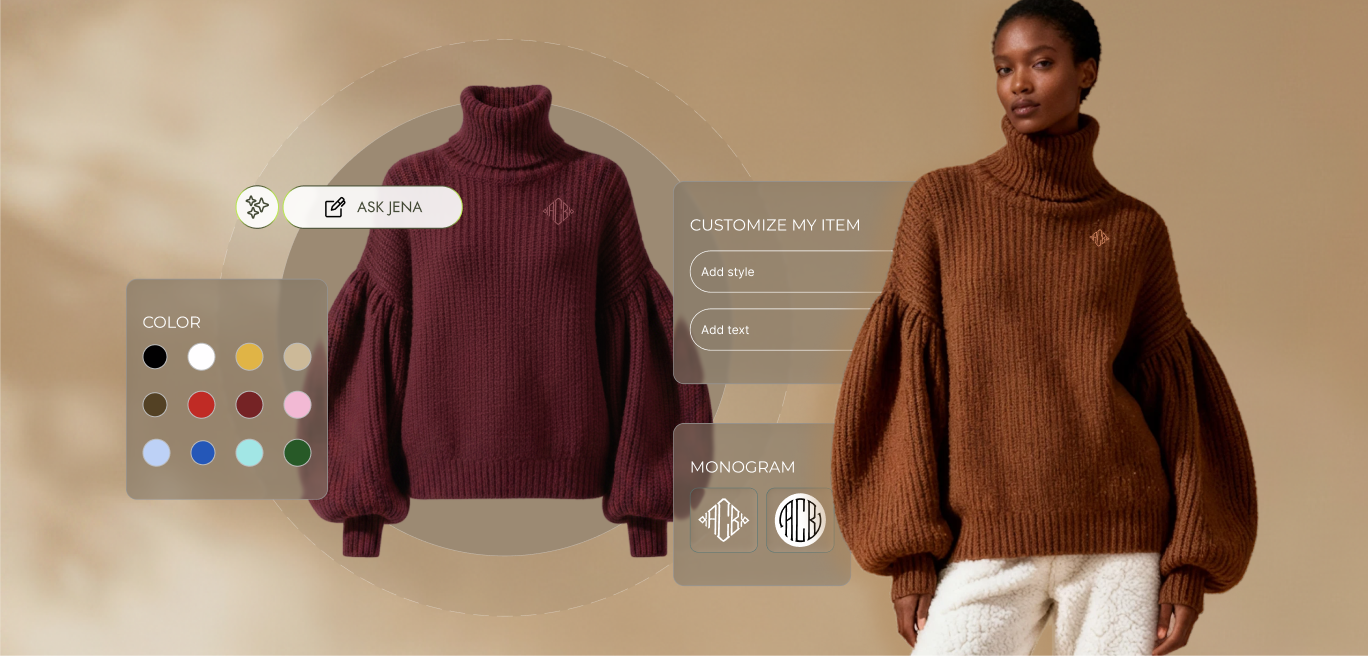
Woolfaire Personal Assistant is the personal side project, conceptualizing a new layer of customer profile builder at the clothing store.
This started with a project at Astound. I helped re-platform a US fashion brand, optimizing their product configurator for monogramming and embroidery on woollen products. Customer feedback told us something the metrics alone hadn't: people felt abandoned partway through the customization process. Given the timeline and business requirements, the team scoped it as an MVP, clear goal, clear limitations, and it shipped successfully. But an MVP means some things get set aside on purpose, not solved.
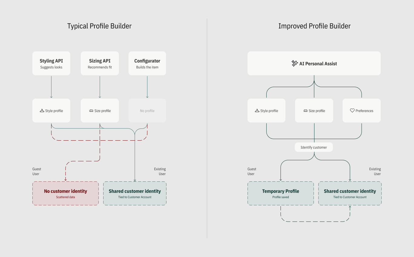
I kept coming back to that feedback. Eventually it turned into a bigger question: what if personalization wasn't one feature, but a layer running through the entire customer journey? An AI assistant that meets a customer at the very start, learns their size, points them to the right products, configures the piece they choose, curates outfits around it, and answers the questions real customers were actually asking, not the ones a form assumes they'll have. So I built my own version of that experience.
My role was product designer: research, concept, design system, and prototypes.
Fashion brands love saying they know you. Fit quizzes. Styling tools. Chatbots. All built to prove it. Some brands do it well. Gucci's concierge remembers your wardrobe. Stitch Fix learns from every item you keep. But that intelligence usually lives in one feature at a time, disconnected from the rest of the shop. A customer tells a styling tool their taste, measures themselves for a sizing quiz, then reaches a product configurator, often the highest-stakes moment of all: a permanent, final sale decision. And the configurator starts from zero. No memory of size, no sense of style, no preview of what they're about to commit to.
This project asks what happens when personalization is designed as one layer that follows the customer everywhere.
Before diving into a design exercise, I needed to know who I was actually designing for. I already had real research in hand from the Astound project, a heuristic evaluation of the original configurator, a competitive analysis, and actual customer feedback, and I used it as the foundation rather than starting from a blank page.
From there, I mapped the persona: a design-conscious luxury shopper who doesn't buy often, but buys carefully. I revealed her primary and secondary goals. And used Jobs to be done framework revealing that a shopper wants the high-end experience to start immediately, and quiet assistance guiding choices, and increase trust. I mapped the entire journey stage by stage, from the first homepage visit to the moment she needs support months later, and asked the same question at every step: does this page already know her? That question became a feature map, and the honest answers, grounded in the research, not assumption, shaped the scope.
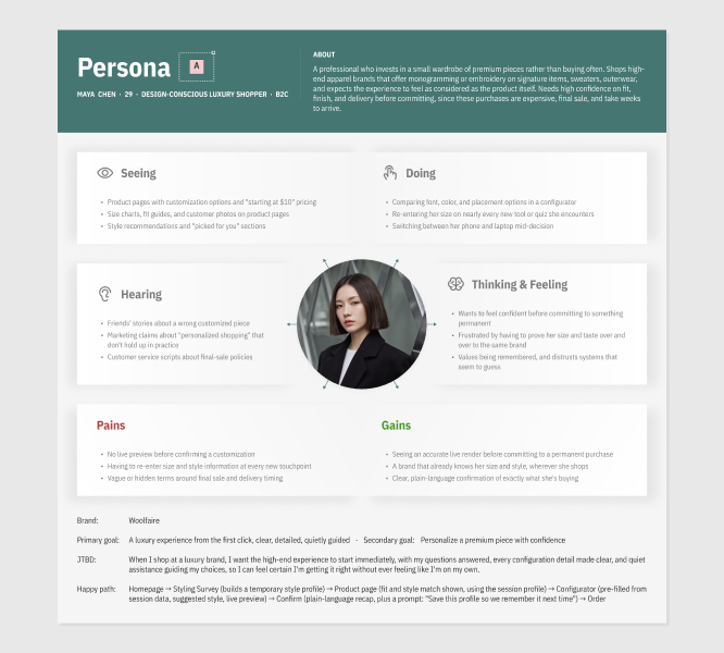


User Needs: Customers don’t want a chatbot waiting to be summoned, but an assistant that opens the conversation, remembers what it learns, and uses it to guide them, the way a trusted sales associate.
Pain Points: Typically nothing approaches the customer first. They have to go looking for help, and even then, every tool asks them to start over, re-entering their size, preferences with no memory carried between the two.
The insights pointed to one clear answer: build the assistant Jena, and every customer like her, already expects from a good sales associate, not a form, a presence. Rather than spreading that ambition thin across the whole site, I scoped the project around the moment it matters most: search, product selection, and the product configurator. The idea was to create an experience that would resemble a concierge.
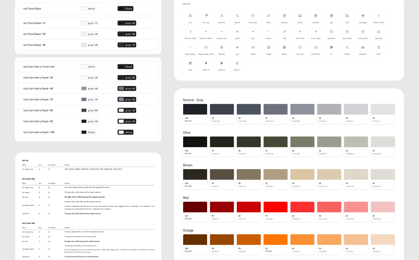
In parallel with my research I began building a design system (I decided to create everything from scratch), thinking about core principles and processes to guide the project. I used the components and pattern libraries, set the visual language, colors, typography, and the accessibility principles.
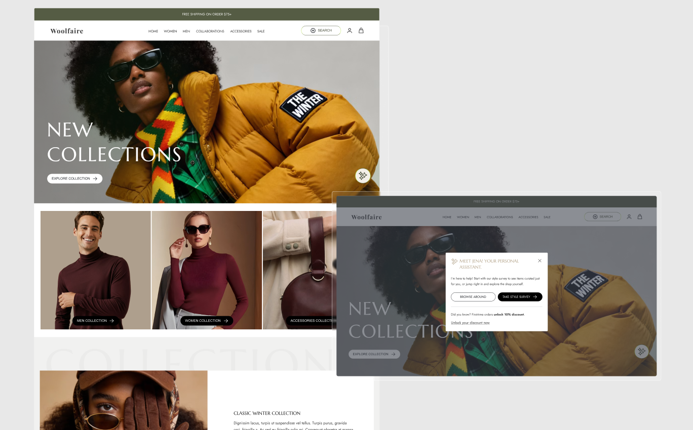
Meet and Greet - Homepage
This is where Jena, the assistant, first introduces herself, quietly. A sparkle icon sits in the corner of the hero banner at all times, present without demanding attention. Tapping it opens a short greeting with two honest paths: browse on your own, or take a quick style survey for curated picks. Neither is treated as correct, the assistant offers a shortcut, but never blocks the customer who'd rather explore first. For a returning customer, this same entry point changes quietly. Jena greets them by name, skips the survey since their size and style are already known, and offers something earned instead, "Welcome back, here's what's new in your style." That shift is the whole idea: the first visit earns trust by asking, every visit after earns it by remembering.
Style Survey
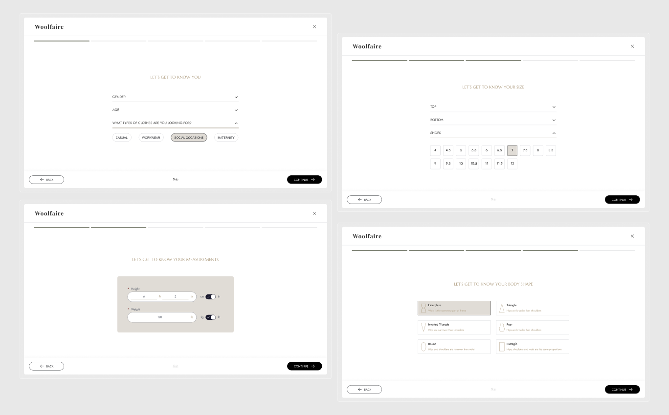
When users take the style survey, they move through a short, guided flow, clothing preferences, measurements, sizing per category, and body shape, all visible on one progress bar, so they always know how much is left. Most fields are optional, but a few are required, height and weight, for example, since these directly power fit accuracy and can't be meaningfully guessed. The assistant asks for the minimum it truly needs, and is honest about which few things it can't work without.Everything gathered here writes into the shared identity layer. This is where "remember once" actually begins.
Search / Product Suggestions
This component reuses the same product grid as browsing, so search never feels like a separate destination. Jena sits alongside the results, offering a few starting points, so the customer can recognize what they want instead of typing it from scratch. Selecting a category updates the grid and Jena's response together, in sync. She confirms in plain language while the tiles update to match, so there's never a gap between what she says and what's shown.Hovering any tile surfaces additional options: Find Similar, Style With, and Ask Jena. Choosing Style With returns two or three specific pairings as product cards inside the chat, never a text description the customer has to picture on their own.

PDP Assist
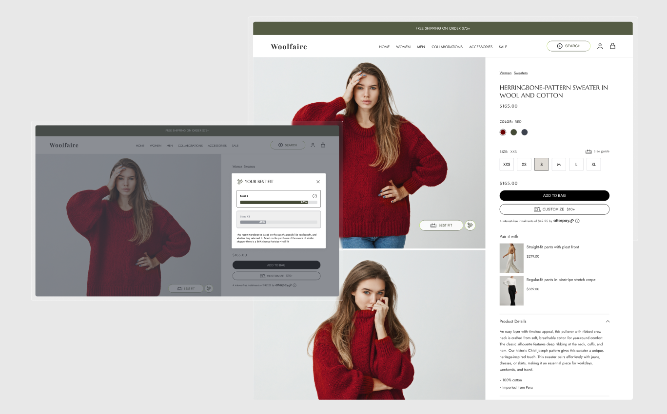
Jena here only speaks when it actually has something to say. It parses the available statistics in the background, and only once a confident size recommendation exists does a new CTA appear directly beside the sparkle icon, "Best Fit", inviting the customer to click.
Customization Assist
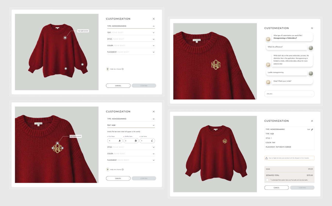
Three things changed in the configurator itself. Jena is now embedded directly in the flow, ready to help choose a style or answer questions about production and sewing technique, appearing as an inline chat rather than a separate screen. A live preview reflects every change immediately in the image gallery, so nothing is confirmed unseen. And the order summary states the exact price tied to each customization choice, not just a final total. Asking Jena any question gets a plain, direct answer inline, no separate FAQ, no leaving the flow. Everything is transparent: the final-sale terms and delivery window.
I structured this project around the Double Diamond, discover, define, develop, deliver, because the problem wasn't one broken screen, it was a pattern repeating across disconnected features, and that only becomes visible with honest research first. Discovery started with a heuristic evaluation of the original configurator, a competitive analysis against 4 fashion brands, and real customer feedback from the original Astound project. That pointed to one thesis: personalization that doesn't travel with the customer has to be re-earned every time. From there, a persona and journey map, became a feature map that set the real scope.
I chose this framework because the problem was equal parts systems challenge and design challenge, the shared identity layer and the actual screens had to be defined together before either could be trusted. Before designing anything, I wrote five design principles as a testable filter, remember once, suggest don't decide, show don't tell, state confidence honestly, one pattern everywhere, then built the wireframes and prototypes, meet and greet, style survey, product suggestions, PDP assist, customization assist, each one answering a specific finding from discovery.
A project like this doesn't have live traffic, so "success" can't come from real conversion numbers. I used benchmarking instead, measuring the redesign against research the industry already trusts, and against the same audit this project started with.The results of the heuristic re-evaluation were the following:
This started with a question I couldn't answer on a real project: what if the configurator already knew the customer instead of asking her to start over? The answer wasn't a smarter feature. It was shared memory, one identity that sizing, styling, and the configurator could all use, instead of three separate tools working alone. This fixes the four problems the challenge began with. Sizes are remembered instead of re-entered. Suggestions come pre-filled instead of blank. Nothing final gets confirmed unseen. And trust gets built into the product, instead of fixed later by a support call. None of the pieces are new, sizing, styling, and live preview already exist elsewhere. What was missing was connecting them, and holding every screen to the same standard.
Shared experiences from the product minds and engineering partners I’ve worked with.


I worked with Oxana for more than 3 years and she is an amazing Art Director with great UX skills. She is probably the best designer I have worked with. Her dedication and talent know no limits. Her advices are always right and pertinent. She is an incredible asset for any teams.
During her time at Astound, Oxana has consistently proved herself to be an absolute powerhouse Senior UX Designer. In many ways, she functioned as our “special ops” designer - the exact person you want in the room when a product or feature simply doesn't exist yet...
During her time at Astound, I had the pleasure of working with Oxana across multiple projects. She brings genuine enthusiasm to every UX challenge and is highly collaborative in her approach. Oxana builds strong client relationships and confidence through thoughtful...
Oxana’s passion for excellent design shows in everything she does. She tackles every challenge with a smile and brings a perfect mix of designer curiosity and user empathy to the table. Beyond her great professional skills, she is a wonderful person to be around...