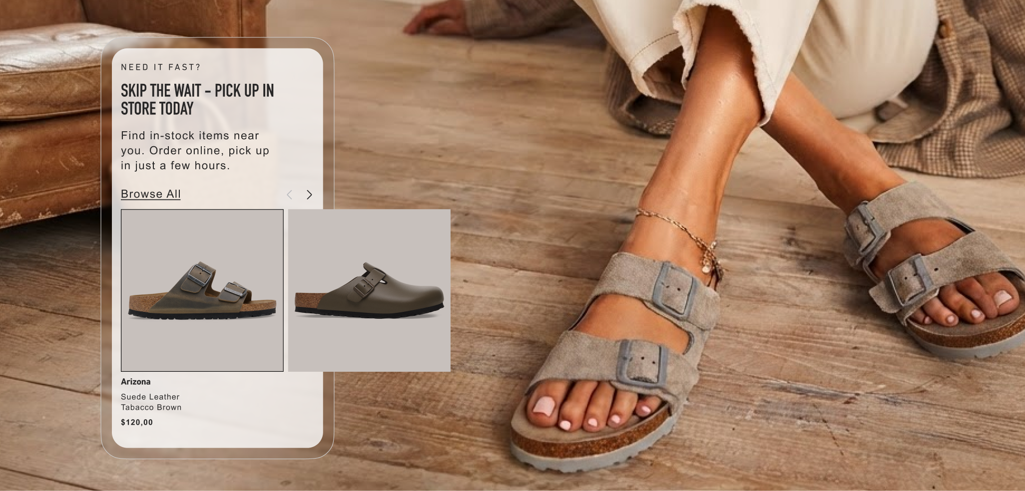
Complete redesign of the BOPIS experience for the existing Shoe Brand for the North American Market.
A Tier-1 footwear brand was expanding its physical footprint fast across the US and Canada. Their Buy Online, Pick Up In Store (BOPIS) service didn't keep pace. It ran on a legacy model that treated pickup as a backend shipping option, available at only a limited number of stores, rather than a real fulfillment channel customers could rely on. As the store network grew, so did the gap between what shoppers expected and what the experience delivered, and shoppers said so, through feedback and behavior alike.
The business goal was direct: turn a fragmented, backend-focused fulfillment process into a transparent, flexible, high-visibility part of the shopping experience, elevating BOPIS from a hidden option to a core way to shop. I worked alongside a PM and a small design team to close that gap. My focus was UX/UI for the BOPIS experience specifically: deep-dive discovery into North American retail friction points, mapping the new omnichannel user flow, defining store-selection logic, and prototyping high-fidelity, mobile-first screens from PDP through checkout confirmation.
When shoppers reach for BOPIS, they're really asking for two things at once: the convenience of shopping online, and the immediacy of a physical store. When that promise breaks, down it breaks in familiar ways, long wait times, no visibility into what's actually in stock nearby, poor communication once an order is placed, and checkout rules too rigid to accommodate how people actually shop.
This project asks how we might transform a fragmented, backend-focused fulfillment process into a transparent, flexible, high-visibility experience that bridges digital expectations with physical retail.
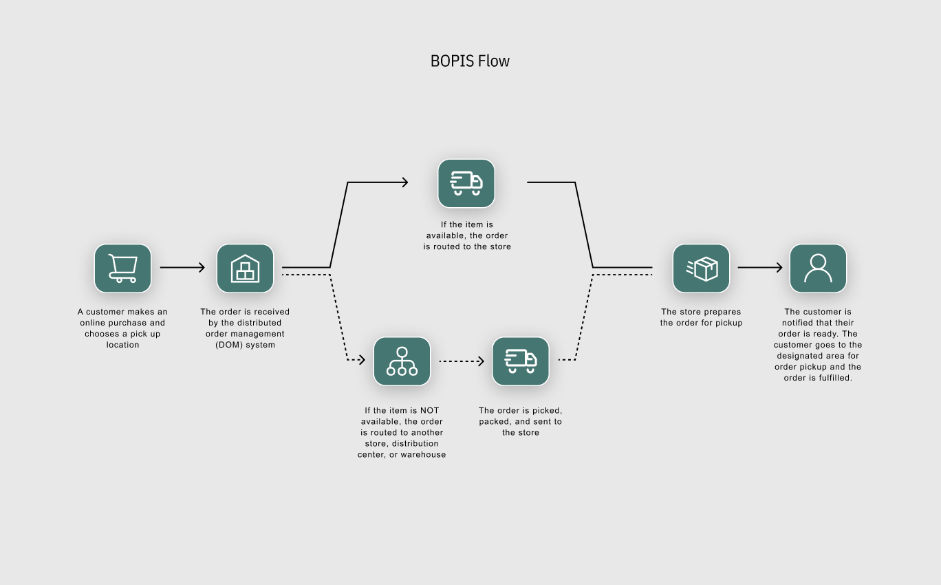
The existing BOPIS flow: a customer buys online and picks a pickup location. If the item's in stock, the order routes straight to that store. If it's not, it reroutes to another store, a distribution center, or a warehouse, then gets picked, packed, and shipped to the pickup point before the customer's notified it's ready. Sound complex? It is, and almost none of that complexity was visible to the shopper. They just experienced the wait.
Before proposing a design, I needed to see the entire journey as the customer actually lived it, not as the org chart assumed it worked. That meant auditing the full existing experience end-to-end: from first awareness on the Product Listing Page (PLP) through post-purchase confirmation emails.Mapping the current journey stage by stage surfaced friction at nearly every step:
I mapped a re-imagined version of the same journey against the same stages, then attached a CSAT and conversion-rate checkpoint to each one, so every fix could eventually be tied back to a measurable outcome, not just a smoother-feeling screen.
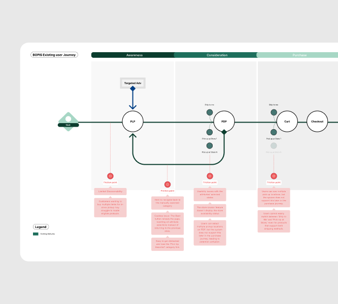
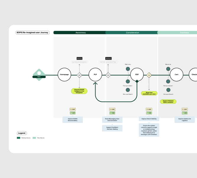

User Needs: Customers want a seamless omnichannel experience, one that pairs the convenience of online shopping with clear, upfront information about pickup availability and timing, so they can confidently decide what works best for them.
Pain Points: Discoverability for in-store pickup items was limited from the start, and layered on top of that were usability issues that created friction and confusion at nearly every stage. Restrictive checkout flows compounded the problem.
The insights pointed to one clear scope: make BOPIS frictionless from discovery through checkout and fulfillment, so the experience feels as reliable as walking into a local store. I defined the core fulfillment flows, prioritized by impact and effort, and used an Insight → Priority → Decision framework to separate:
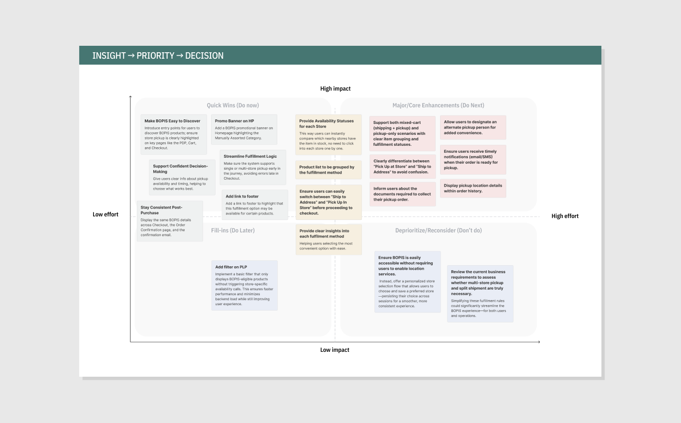
These decisions weren't arbitrary. They're consistent with what Baymard Institute's large-scale checkout research has found: roughly half of sites offering multiple fulfillment options fail to present them all together in the selector interface, quietly pushing customers into unnecessary backtracking. Building all three options into one selector closes that exact gap.
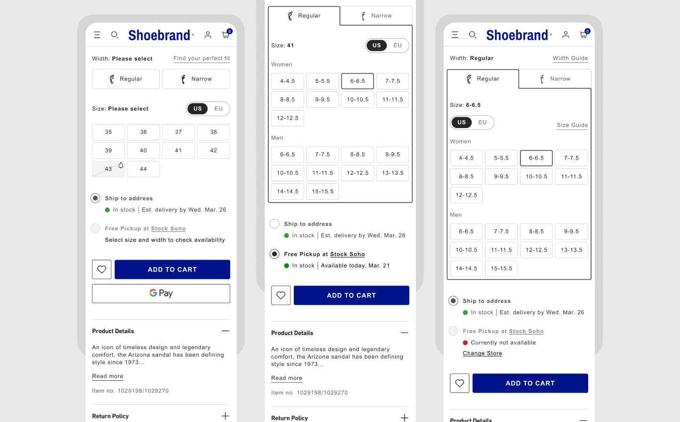
Product Detail Page (PDP)
On the old PDP, the fulfillment choice was easy to miss entirely. "Ship to Me" and "Pick Up at Store" were styled like color swatches, so customers skimmed right past them without registering they were making a decision. When they did notice, the selected and unselected states looked nearly identical, enough that it could appear as if two options were chosen when neither actually was. Even in cases where "Ship to Me" was the only option available, the system still made customers tap it manually before they could add to cart, an unnecessary step for a choice that wasn't really a choice at all. And the moment a customer left the PDP, say, to check their cart, that selection quietly reset. They'd come back to find the fulfillment method wiped, forced to make the decision all over again.
I fixed it by turning fulfillment into a clear radio-style choice, "Ship to Address" or "Free Pickup," each showing live stock status right next to it, so there's never a question of what's selected or what's actually available. When only one option exists, it's chosen automatically. And the selection now sticks: leave the page and come back, and it's exactly where the customer left it.
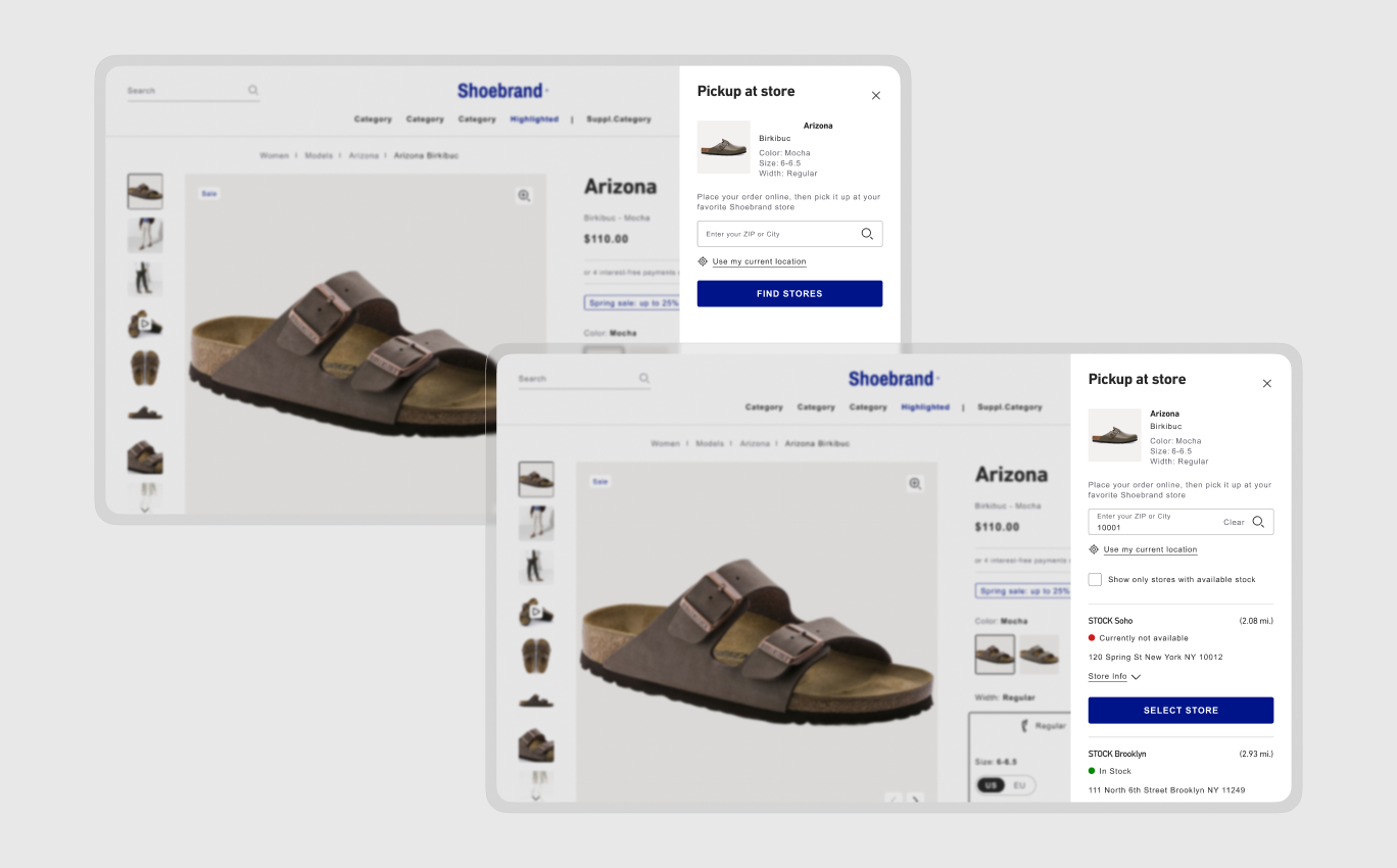
Store selection slide panel
The old version of this flyout kept the full site header active behind it, and the chat widget sat layered on top of the panel itself, so customers were searching for a store while half-distracted by navigation and a chat bubble competing for attention in the same space. Once they searched and got results, "Choose Your Store" listed nearby locations with a radio button next to each, but nowhere in that list did it say whether the item was actually in stock there. A customer could pick a store based on distance alone, confirm it, and only then discover the item wasn't available, after they'd already committed to the trip. And the interaction itself worked against how people naturally click: tapping the store's name or address did nothing, only the small radio button itself registered a selection, so customers instinctively clicking anywhere on the store block would tap right past it.
I rebuilt the panel so stock status sits directly in the list, next to each store, not hidden behind a second step. A "Show only stores with available stock" filter lets customers skip the guesswork entirely. And the whole store card is now clickable, tap the name, the address, anywhere in the block, and it selects, matching the interaction pattern customers already expect.
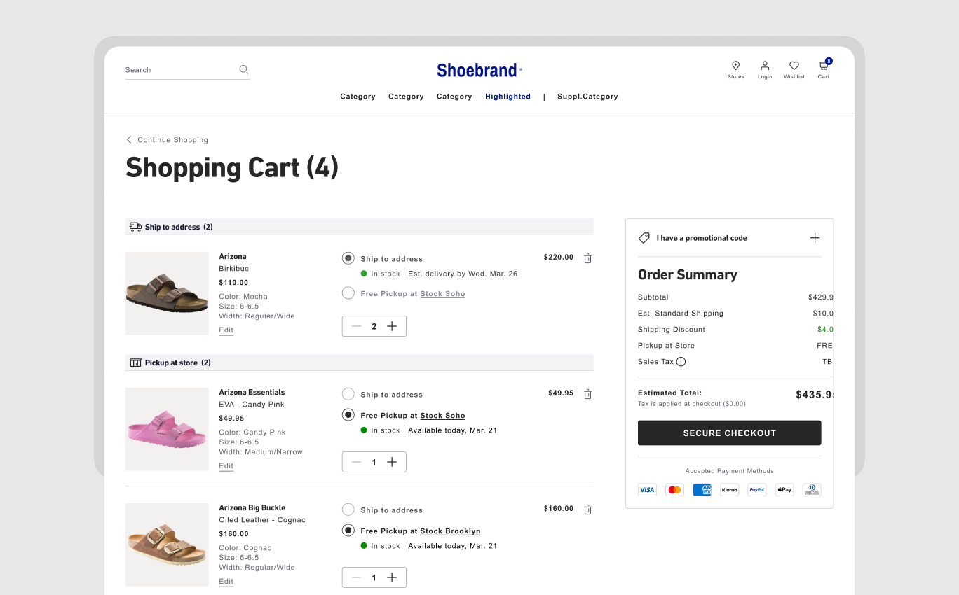
Cart
The old cart quietly allowed split shipments across multiple pickup stores and shipping items in the same order, but it never said so clearly. A subtle banner warned that customers needed to select only one pickup location to proceed, easy to skim past, and when "Proceed to Checkout" greyed out with no visible explanation, customers were left guessing why. The sections themselves, shipping items, items at the Soho store, items at the Brooklyn store, looked nearly identical, so it was easy to lose track of which item belonged where. And if a customer wanted to switch an item from pickup to shipping, or the other way around, the cart offered no way to do it. They had to leave, go back to the PDP, and start over.
The redesigned cart groups items by fulfillment method into visually distinct sections, "Ship to Address" and "Pickup at Store", each carrying its own status and pricing. Multiple pickup locations are now explicitly supported rather than quietly restricted, so what used to be a confusing dead end becomes a legitimate, visible part of the flow. And every item carries its own inline toggle, so a customer can switch a single item's fulfillment method right there in the cart, no detour back to the PDP required.
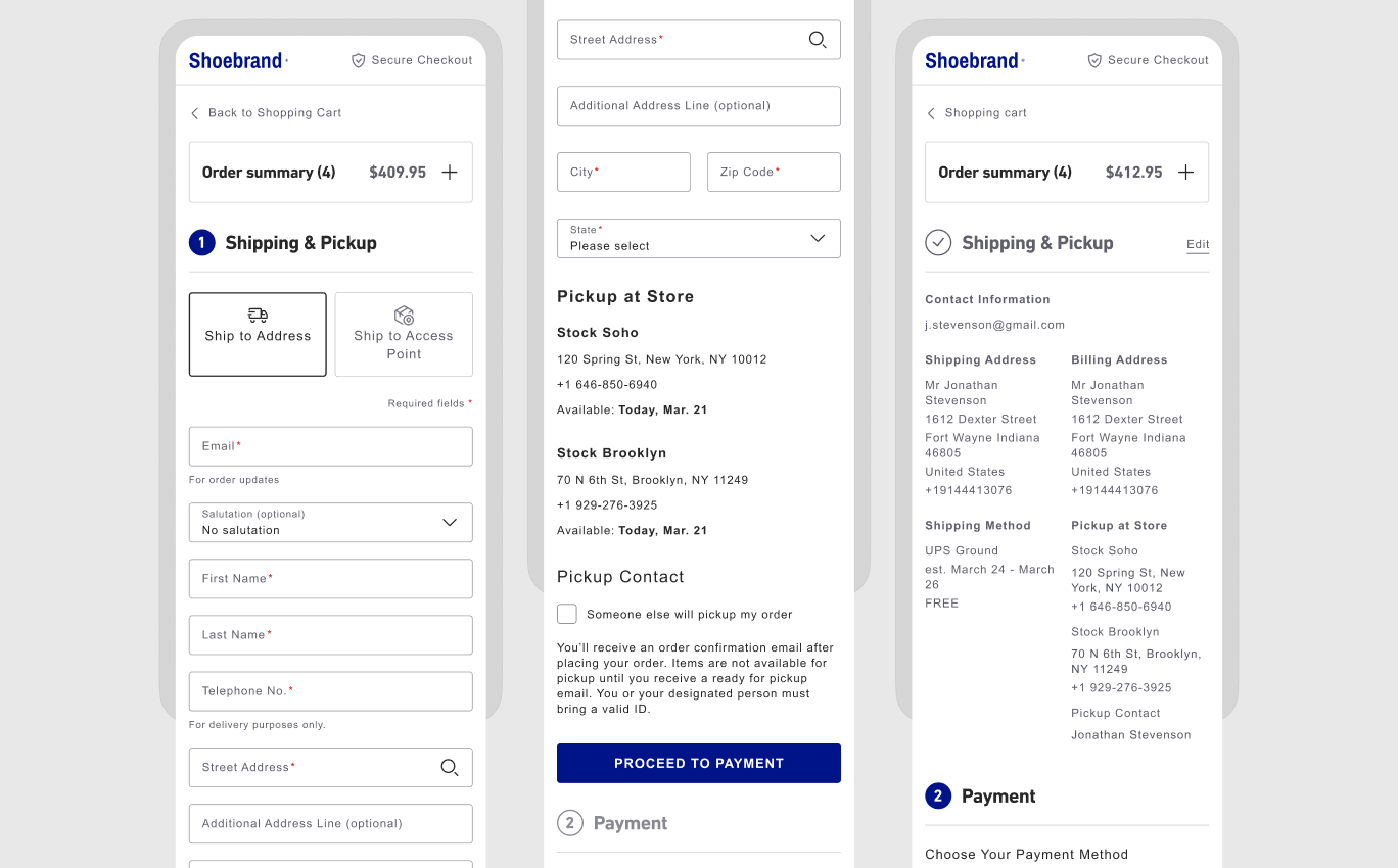
Checkout
The old checkout opened with a single "Delivery" or "Pickup Point" toggle at the top of the shipping form, as if the entire order used one fulfillment method. But the order summary sitting right beside it already showed a mixed cart, some items shipping, others tagged for pickup at a specific store, so the form at the top didn't match what the customer had actually built below it. Partway through, an address verification step interrupted the flow with a "suggested" versus "entered" address choice, an extra decision dropped into the middle of checkout without warning. And by the time customers reached order review, the pickup location was labeled "Shipping Address," the exact same header used for the real shipping address block sitting right next to it, so at a glance it looked like the order had two shipping destinations instead of one shipping address and one store pickup.
I gave pickup and shipping their own distinct sections all the way through checkout, not just in the cart. Pickup items show the store's address, hours, and a dedicated pickup-contact option in place of a shipping form, and the section is labeled "Pickup at Store," never disguised as a second shipping address. By the time a customer reaches review, what's on screen matches the mixed order they actually built, item for item, with nothing relabeled or merged along the way.
I chose Lean UX because the problem wasn't a single broken screen, it was a pattern of friction spread across a live, already-shipping product, with a small cross-functional team and a two-month window. That combination called for tight build-measure-learn cycles over a heavier upfront research phase. Working alongside a PM and other designers, I focused specifically on the UX/UI layer of BOPIS: I paired discovery directly with early wireframes rather than treating them as sequential phases, validated flow assumptions with the team before investing in high fidelity, and prioritized the Insight → Priority → Decision matrix as a shared artifact the whole team could align around, not just a personal design tool. That kept design decisions grounded in what the team could realistically ship within the two-month scope, while still tracing every screen back to a specific friction point from discovery.
This project didn't ship to live traffic within the case study window, so results here are benchmarked against the friction identified in discovery and against established e-commerce research, not projected revenue figures.
Given more runway, I'd want to validate the store-selection and mixed-cart flows with moderated usability testing before finalizing high-fidelity screens, especially the mixed-cart checkout, which introduces the most new complexity and would benefit most from watching real customers navigate it. I'd also push earlier to define what "ready for pickup" actually means operationally across different store formats, since that assumption shapes both the notification timing and the pickup-contact flow, and getting it wrong post-launch would be costly to unwind.
Shared experiences from the product minds and engineering partners I’ve worked with.


I worked with Oxana for more than 3 years and she is an amazing Art Director with great UX skills. She is probably the best designer I have worked with. Her dedication and talent know no limits. Her advices are always right and pertinent. She is an incredible asset for any teams.
During her time at Astound, Oxana has consistently proved herself to be an absolute powerhouse Senior UX Designer. In many ways, she functioned as our “special ops” designer - the exact person you want in the room when a product or feature simply doesn't exist yet...
During her time at Astound, I had the pleasure of working with Oxana across multiple projects. She brings genuine enthusiasm to every UX challenge and is highly collaborative in her approach. Oxana builds strong client relationships and confidence through thoughtful...
Oxana’s passion for excellent design shows in everything she does. She tackles every challenge with a smile and brings a perfect mix of designer curiosity and user empathy to the table. Beyond her great professional skills, she is a wonderful person to be around...